

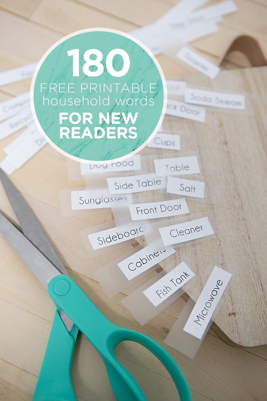
The implementation of environmental print within the home has emerged as a significant strategy for parents and educators seeking to bolster early childhood literacy through immersive, everyday experiences. Recent developments in pedagogical DIY (Do-It-Yourself) resources, such as the 180-word household labeling system popularized by literacy advocates and digital creators like Jen Causey-Kidder of Something Turquoise, highlight a shift toward functional education over domestic aesthetics. By transforming common living spaces into interactive learning laboratories, these systems leverage the existing vocabulary of young children to facilitate the transition from verbal communication to visual word recognition.
The Mechanics of Environmental Print in Early Education
Environmental print refers to the text found in everyday life, including signs, labels, and logos. For a developing reader, the ability to recognize a "Stop" sign or a cereal box logo often precedes the ability to read a formal book. The household labeling initiative formalizes this natural cognitive process by systematically placing printed words on the objects they represent.
The methodology relies on the concept of "sight words" and context clues. When a child sees the word "refrigerator" affixed to the appliance they use daily, the cognitive load required to decode the word is significantly reduced. They already possess the concept of the object; the label provides the visual bridge to the written language. This method is particularly effective because it removes the abstraction often found in flashcards, grounding the learning process in the child’s physical reality.
The Critical Role of Typography in Early Literacy
One of the most nuanced aspects of the household labeling system is the selection of typography. Research into early childhood education suggests that the physical structure of letters can either facilitate or hinder a child’s ability to decode text. Many standard digital fonts utilize "double-story" versions of the letters "a" and "g," which differ significantly from the "single-story" versions children are taught to write by hand.
To address this, the Something Turquoise project utilizes the "Champagne & Limousines" font, a clean, sans-serif typeface that mimics the foundational letterforms taught in primary schools. By avoiding stylized flourishes and complex serifs, the labels ensure that "littles"—a term often used for children in the early stages of development—can recognize characters without confusion. This attention to typographic detail reflects a broader understanding of the developmental needs of new readers, where consistency between what a child writes and what they see in their environment is paramount.
Chronology of Implementation: A Four-Day Educational Integration
The process of converting a standard residence into a print-rich environment is not an instantaneous task but a multi-stage project requiring parental commitment and child participation. Based on the successful implementation of the 180-word system, the timeline generally follows a four-day structure:
Phase I: Preparation and Word Selection
The initial phase involves auditing the home to identify key objects that the child interacts with frequently. The 180-word printable list serves as a foundation, covering everything from "door" and "window" to more specific household items like "banister" or "pantry." Parents must filter this list to ensure it matches their specific living situation, skipping irrelevant items to maintain the integrity of the learning environment.
Phase II: Production and Technical Setup
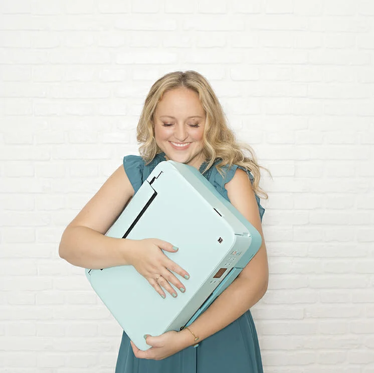
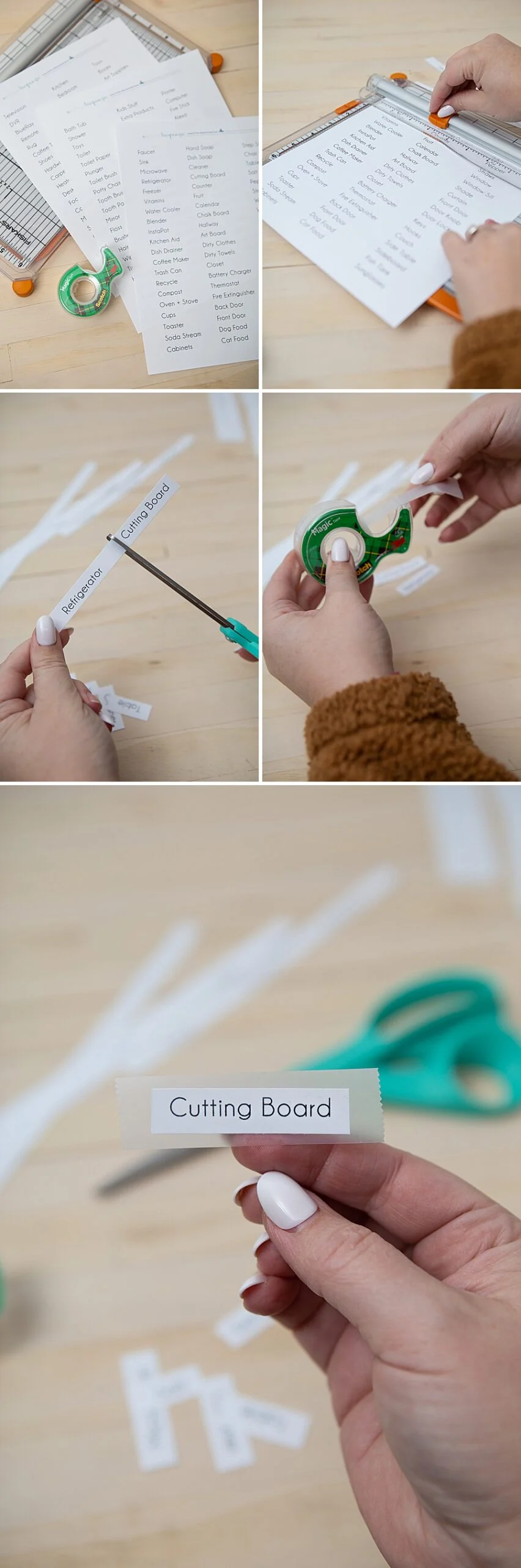
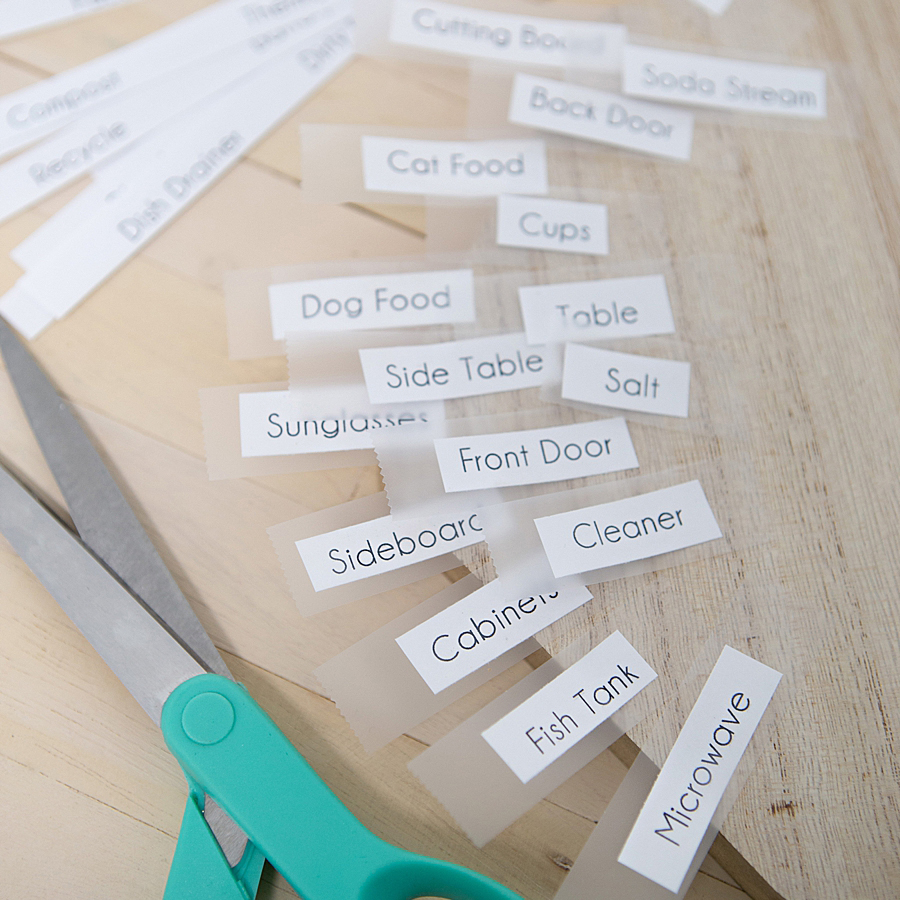
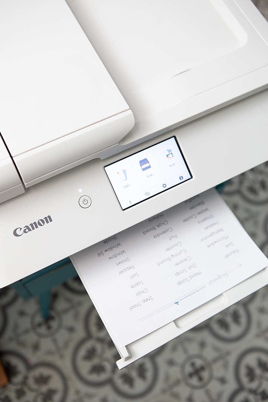
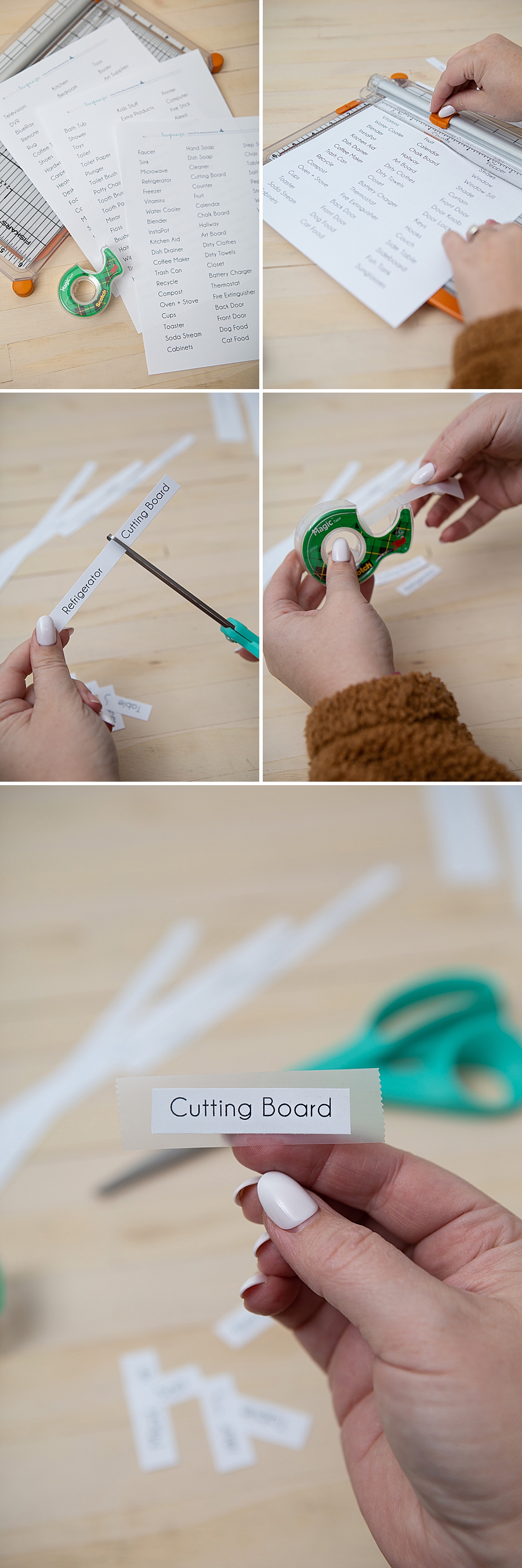
The second stage focuses on the physical creation of the labels. Using standard printer paper and consumer-grade crafting printers—such as the Canon TS9521C—the words are printed in a legible size. The "trim and tape" method is employed here; while not aesthetically "cute" in a traditional interior design sense, the white-and-black labels provide high contrast, which is essential for visual processing in young children.
Phase III: Collaborative Placement
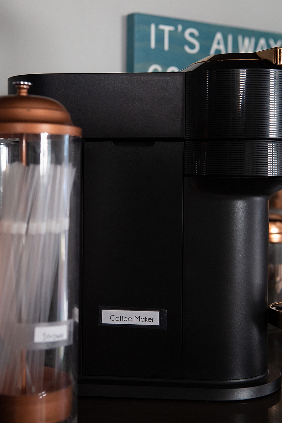
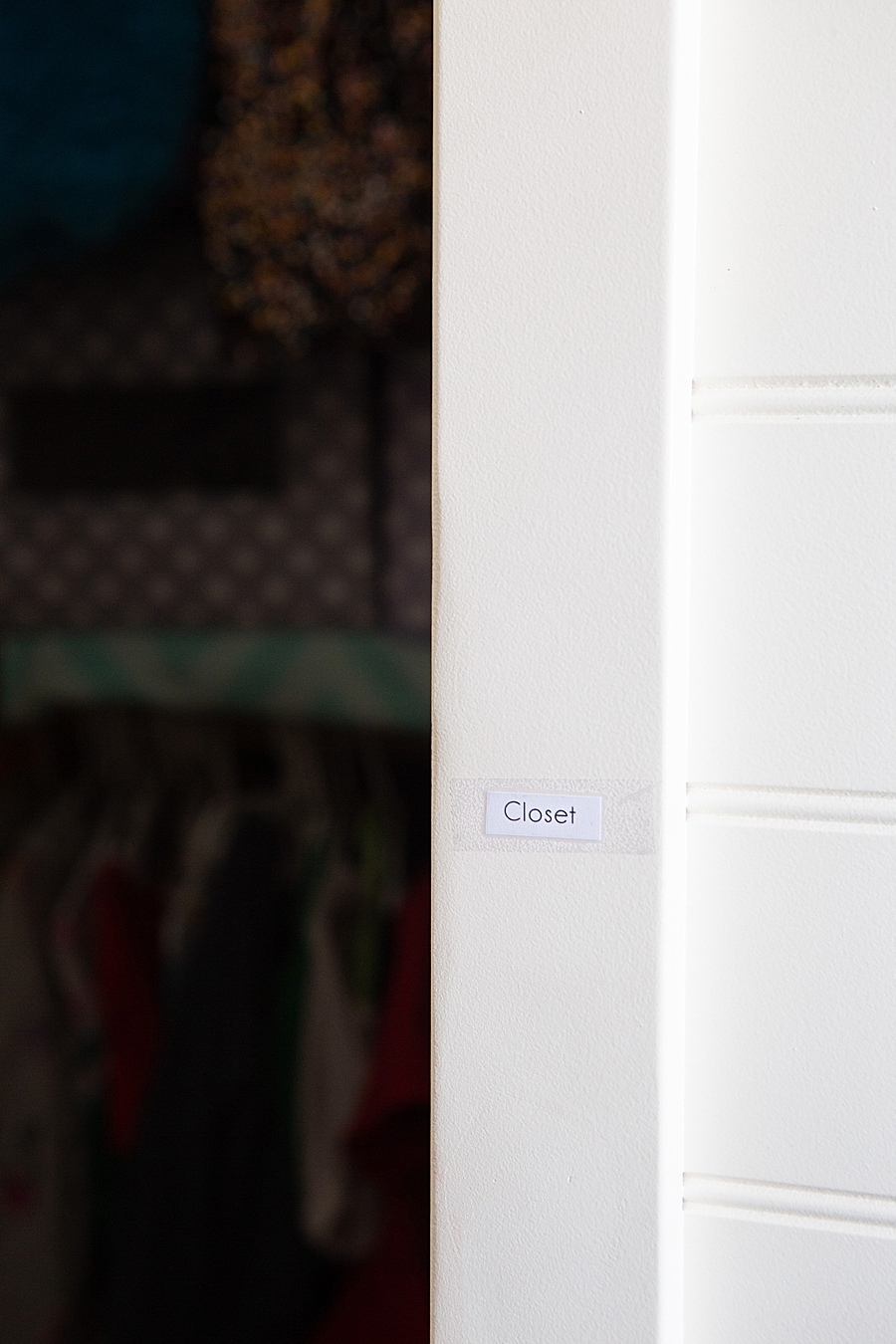
The most critical pedagogical step occurs during the placement of the labels. By involving the children in the process of walking through the house and identifying where each word belongs, the activity shifts from a passive decorative change to an active learning game. This collaborative effort reinforces the connection between the word and the object through physical movement and tactile engagement.
Phase IV: Active Interaction and Reading Walks
Once the house is fully labeled, the final phase involves daily "reading walks." Family members navigate the home, pausing to read labels aloud. This repetition builds fluency and confidence. Over the course of several days, the child begins to anticipate the labels, eventually reading them independently as they move through their daily routines.
Supporting Data: The Impact of Print-Rich Environments
The efficacy of household labeling is supported by extensive linguistic research. According to the "Home Literacy Environment" (HLE) framework, the density of print materials in a child’s home is one of the strongest predictors of later reading achievement. A 2019 study published in the journal Early Childhood Research Quarterly found that children exposed to frequent environmental print labeling showed significantly higher scores in letter-word identification and phonological awareness.

Furthermore, the "Word Gap" theory—originally proposed by researchers Hart and Risley—emphasizes the importance of the volume of words a child is exposed to in their early years. While their research focused on spoken words, modern extensions of this theory include visual exposure. By adding 180 distinct labels to a home, parents are effectively increasing the "visual word count" of a child’s daily life by thousands of impressions per week.
Analysis of Functional vs. Aesthetic Domesticity
A notable aspect of the Something Turquoise report is the explicit acknowledgement that these labels are "not cute." This highlights a tension in modern parenting between the desire for a "Pinterest-perfect" home and the practical needs of child development. The decision to prioritize functionality over aesthetics is a strategic one.
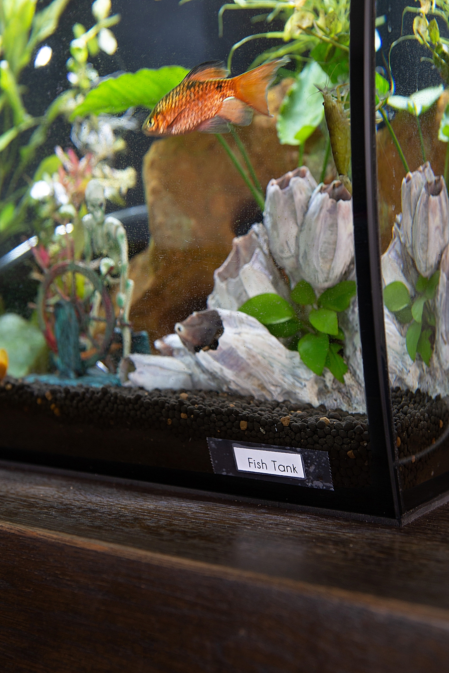
Socially, the presence of labels throughout a home often prompts curiosity from guests and visitors. While some may view the labels as domestic clutter, the consensus among educational professionals is that the "priceless" nature of the child’s learning outweighs the temporary disruption of the home’s visual appeal. This shift suggests a growing trend where parents are willing to sacrifice traditional home decor standards in favor of "living classrooms" that support academic milestones.
Implications for Early Childhood Literacy Programs
The success of the 180-word household labeling system has broader implications for literacy programs and community outreach. As schools and libraries look for ways to support families during the formative years before formal schooling begins, low-cost, high-impact DIY solutions like this provide a scalable model.
- Accessibility: Because the system requires only paper, a printer, and tape, it is accessible to a wide range of socioeconomic groups. It democratizes high-level literacy support that might otherwise be found only in expensive private tutoring or specialized educational software.
- Parental Agency: The system empowers parents to take an active role in their child’s education. Rather than relying solely on external educators, parents become the primary facilitators of visual literacy.
- Digital-to-Physical Transition: In an era dominated by screen-based learning apps, the household labeling system provides a necessary physical and tactile alternative. It encourages children to look away from tablets and engage with their physical surroundings, fostering a more holistic form of cognitive development.
Conclusion
The 180-word household labeling system represents more than just a home organization project; it is a calculated educational intervention that utilizes the domestic environment to foster early reading skills. By focusing on the science of typography, the psychology of environmental print, and the benefits of collaborative learning, the initiative provides a blueprint for parents to transform their homes into immersive literacy centers. While the visual result may be unconventional, the long-term cognitive benefits for new readers suggest that functional education is increasingly finding a permanent place in the modern home. As children continue to interact with these labels, the "magic" of visualization turns familiar objects into the building blocks of a lifetime of literacy.