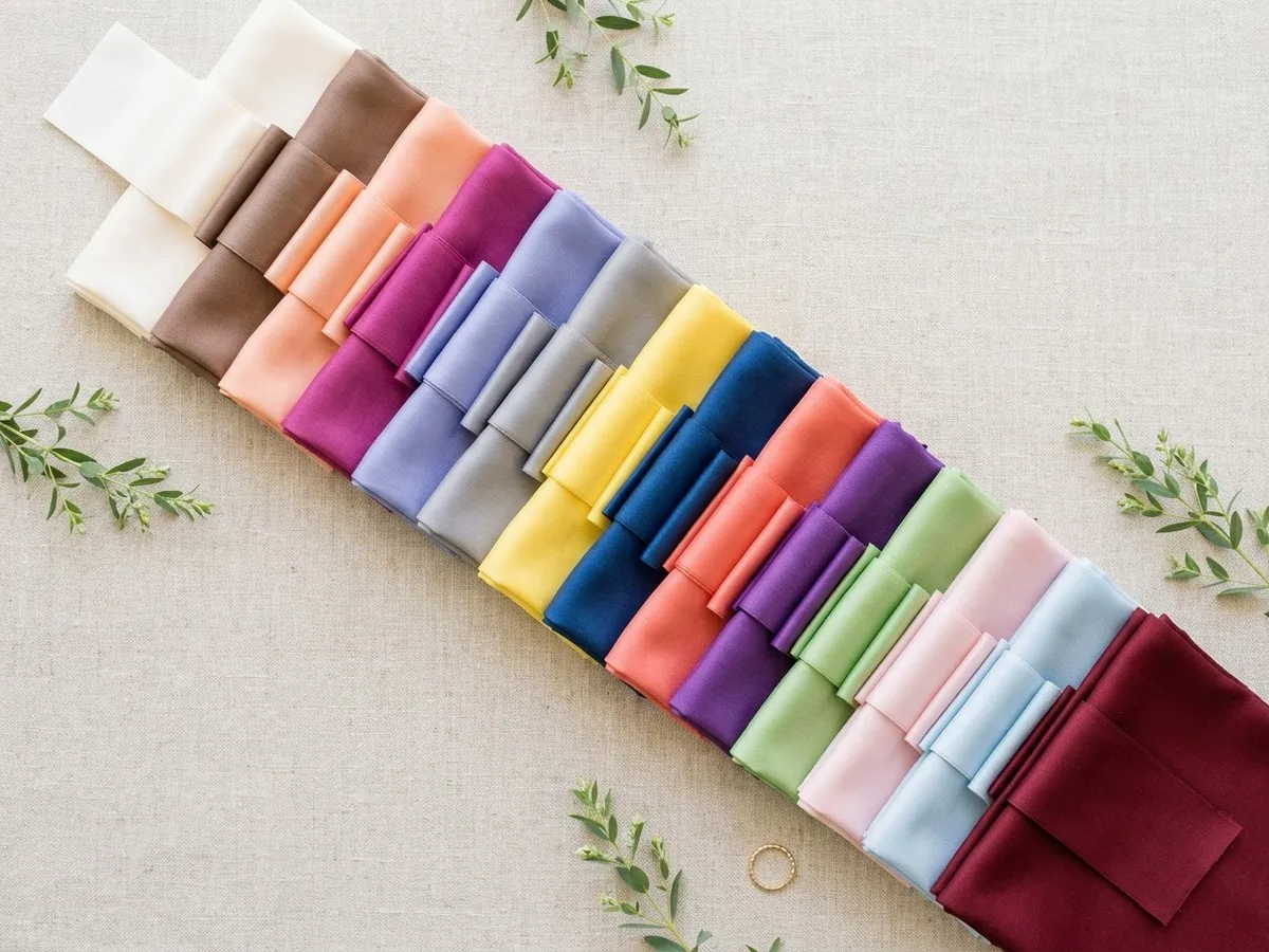
Every December, the Pantone Color Institute unveils its highly anticipated Color of the Year, a declaration that reverberates across industries from fashion and interior design to product development and graphic arts. For the wedding sector, this annual announcement triggers a flurry of activity and a perennial question from couples and planners alike: how does this designated shade translate into a cohesive and memorable wedding aesthetic? This comprehensive guide delves into the Pantone Colors of the Year since 2015, offering an in-depth analysis of their characteristics, optimal pairings, and strategic, budget-conscious applications within the bridal landscape.
The Enduring Influence of the Pantone Color Institute

The Pantone Color Institute, a subsidiary of Pantone, LLC, is globally recognized for its standardized color matching system. Its annual Color of the Year selection transcends mere trend forecasting; it is a meticulously researched symbol reflecting global culture, mood, and societal shifts. A team of color experts meticulously scans the world for new color influences, drawing inspiration from emerging technologies, art exhibitions, travel destinations, socio-economic conditions, and even new lifestyles. This rigorous process culminates in a hue intended to capture the zeitgeist, providing a powerful visual message that resonates on a global scale.
For the wedding industry, this designation serves as both a compass and a catalyst. While classic whites, ivories, and pastels remain timeless staples, the Pantone Color of the Year introduces a fresh perspective, encouraging innovation and guiding the evolution of bridal trends. From haute couture bridal gowns to bespoke stationery and floral arrangements, the chosen color subtly, and sometimes overtly, influences design choices, supplier inventories, and the overall aesthetic direction of nuptial celebrations. Wedding industry analysts frequently highlight the dual challenge and opportunity presented by the Pantone Color of the Year. While it offers a clear trend direction, the true artistry lies in its nuanced application, often best utilized as an accent to complement a broader, more personal palette rather than dictating the entire theme.
A Chronology of Nuptial Hues: Pantone’s Impact on Weddings Since 2015

The following timeline details each Pantone Color of the Year since 2015, exploring its inherent qualities, potential psychological associations, and practical, budget-savvy integration into wedding designs.
2026: Cloud Dancer (PANTONE 11-4201)
For the first time in its history, Pantone designated a white as its Color of the Year in 2026, selecting Cloud Dancer. This soft, airy off-white possesses a subtle warmth, distinguishing it from stark, clinical whites. Pantone’s rationale for this choice centered on its calm, quiet, and grounding attributes, representing a desire for simplicity and serenity in an increasingly complex world.

- Description & Psychology: Cloud Dancer embodies purity, tranquility, and new beginnings. Its gentle warmth suggests comfort and a welcoming embrace, making it a natural fit for matrimonial symbolism.
- Wedding Application & Implications: The selection of Cloud Dancer was widely welcomed by the bridal industry, which often sees variations of white as foundational. It is perhaps the most effortlessly integrated Color of the Year. It forms an impeccable base for a myriad of styles, from minimalist chic to grand classical affairs. It can be showcased in the bride’s gown, bridesmaid dresses in varying textures (silk, chiffon, lace), or groom’s attire (ivory dinner jackets, light linen suits). For decor, it lends itself to elegant table linens, ethereal drapes, and sophisticated floral arrangements featuring white roses, peonies, or hydrangeas.
- Pairings & Versatility: Cloud Dancer pairs exquisitely with sage and eucalyptus greens for a fresh, botanical garden aesthetic. When combined with champagne and soft gold, it elevates the celebration to a classic black-tie affair. For a warm, rustic fall wedding, terracotta and rust hues provide a striking contrast and depth. Its inherent neutrality allows it to adapt seamlessly to any season.
- Budget-Friendly Integration: Leveraging Cloud Dancer is inherently budget-friendly given its prevalence in wedding supplies. Couples can utilize affordable white fabrics for draping, source simple white candles, or opt for abundant yet inexpensive white florals like baby’s breath or carnations. DIY painted signage or elegant white ribbon accents are also cost-effective ways to incorporate this serene shade.
2025: Mocha Mousse (PANTONE 17-1230)
Mocha Mousse, a warm, creamy brown hue reminiscent of rich milk chocolate or a perfectly frothed latte, was Pantone’s choice for 2025. This color was introduced as a grounding and comforting shade, reflecting a desire for stability and a connection to natural elements.
- Description & Psychology: This sophisticated brown evokes feelings of warmth, comfort, and authenticity. It suggests reliability and a timeless elegance, providing a sense of depth and understated luxury.
- Wedding Application & Implications: Mocha Mousse is a natural and sophisticated fit for fall and winter weddings, adding a profound richness that surpasses traditional beige or taupe. It excels in creating rustic-chic, bohemian, or elegantly refined atmospheres. Bridesmaid dresses in mocha satin or velvet offer a luxurious touch, while groom’s accessories like ties or pocket squares can echo the shade. It can be elegantly incorporated into wooden decor, leather accents, or unique stationery printed on textured paper.
- Pairings & Versatility: For a soft, romantic look, Mocha Mousse pairs beautifully with cream and blush. A surprising yet effective contrast can be achieved with dusty blue, adding a modern edge. For a quintessential autumn table, burnt orange and deep green create a rich, inviting palette.
- Budget-Friendly Integration: Incorporating Mocha Mousse on a budget can involve using coffee bean accents in centerpieces, utilizing brown kraft paper for stationery, or sourcing thrifted wooden elements that can be stained or polished. Rich brown linens, readily available for rent, can anchor the color scheme.
2024: Peach Fuzz (PANTONE 13-1023)

Peach Fuzz, a gentle, velvety peach nestled delicately between pink and orange, was selected as the 2024 Color of the Year. Pantone described it as warm, comforting, and nurturing, symbolizing community, tenderness, and a desire for connection.
- Description & Psychology: This tender hue radiates softness, compassion, and a subtle playfulness. It evokes a sense of well-being and a gentle embrace, fostering an atmosphere of warmth and intimacy.
- Wedding Application & Implications: Peach Fuzz offered a fresh, approachable alternative to more saturated tones, tapping into a desire for softness and warmth in wedding palettes. Its versatility means it works across all seasons, adapting its mood based on complementary colors. It shines in flowing chiffon bridesmaid dresses, delicate floral arrangements featuring peach roses, ranunculus, or tulips, and signature cocktails.
- Pairings & Versatility: In winter, Peach Fuzz creates a sophisticated warmth when paired with silver and white. Spring weddings can embrace its fresh side with yellow and light blue. For summer, lavender or lush greenery provide a vibrant, natural backdrop. In fall, rust and gold amplify its inherent warmth, creating a cozy and inviting ambiance.
- Budget-Friendly Integration: Budget-savvy couples can incorporate Peach Fuzz through inexpensive peach-toned ribbons, DIY floral arrangements using seasonal blooms like carnations or grocery store roses, or by printing stationery on peach-hued cardstock. Adding fresh peaches or apricots to dessert tables or as subtle decor elements can also be cost-effective.
2023: Viva Magenta (PANTONE 18-1750)
Viva Magenta, a bold, audacious crimson red infused with a hint of pink, was Pantone’s choice for 2023. This vibrant hue was presented as brave, fearless, and pulsating, representing vigor, power, and an embrace of self-expression in a post-pandemic world.

- Description & Psychology: Viva Magenta is an energetic and celebratory color, symbolizing strength, passion, and a fearless spirit. Its intensity demands attention, making it a statement-making choice.
- Wedding Application & Implications: While a striking choice, wedding professionals noted its intensity required careful balancing, often serving as a vibrant accent rather than an overwhelming primary color. It is ideal for couples desiring an energetic, fashion-forward, or distinctly modern wedding palette. It can be seen in dramatic floral installations, statement accessories like shoes or jewelry, vibrant mood lighting, or bold stationery.
- Pairings & Versatility: To soften its intensity, Viva Magenta pairs well with blush and ivory. For a rich, jewel-tone aesthetic, deep green provides a luxurious contrast. When combined with black and gold, it creates a sophisticated and glamorous atmosphere perfect for an evening wedding.
- Budget-Friendly Integration: Incorporating Viva Magenta affordably can involve selecting single, impactful floral pieces, such as a large bouquet or a dramatic centerpiece, using readily available colored napkins or tablecloths, or creating signature cocktails with a magenta hue. Bold ribbons or spray-painted decorative elements can also introduce the color without significant expense.
2022: Very Peri (PANTONE 17-3938)
Very Peri, a dynamic periwinkle blue with violet-red undertones, was custom-created by Pantone for 2022. It blended the constancy of blue with the energetic and imaginative qualities of purple, symbolizing transformation, creativity, and the digital future.
- Description & Psychology: This novel hue exudes curiosity, intrigue, and a playful spirit. It represents a forward-looking perspective and a blend of tradition with innovation.
- Wedding Application & Implications: Very Peri offered a fresh alternative to traditional wedding blues, appealing to couples seeking something distinctive and whimsical. Its unique blend makes it a lovely choice for spring and summer weddings, lending itself to ethereal, modern, or whimsical themes. It can be showcased in ombre effects in fabrics or florals, unique floral choices like hydrangeas or sweet peas, and contemporary stationery designs.
- Pairings & Versatility: Very Peri harmonizes beautifully with silver and white for a crisp, modern look. Butter yellow introduces a cheerful contrast, while lilac and sage create a serene and romantic garden palette.
- Budget-Friendly Integration: Budget-conscious couples can incorporate Very Peri through ribbons, dyed fabrics for table runners or chair sashes, or by painting glass vases or candle holders. Small periwinkle flowers or even edible flowers on desserts can add delicate touches.
2021: Ultimate Gray (PANTONE 17-5104) and Illuminating (PANTONE 13-0647)

In an unprecedented move reflecting the global challenges of the preceding year, Pantone chose two independent colors for 2021: Ultimate Gray, a steady and dependable mid-tone gray, and Illuminating, a bright, sunny yellow. This dual selection symbolized resilience, hope, and the human spirit’s ability to overcome adversity.
- Description & Psychology: Ultimate Gray represents steadfastness, composure, and endurance, while Illuminating signifies warmth, cheerfulness, and optimism. Together, they create a message of strength and hope.
- Wedding Application & Implications: This harmonious duo resonated deeply, reflecting the cautious optimism prevalent during its release, offering both grounding and upliftment. The gray provides a sophisticated and stable base, allowing the vibrant yellow to pop. It’s a versatile palette for both crisp spring weddings and more grounded, elegant affairs. It can be seen in gray bridesmaid dresses with yellow floral accents, elegant gray suits, or cheerful yellow bouquets featuring sunflowers or tulips.
- Pairings & Versatility: This pairing works exquisitely with white and silver for a crisp, contemporary spring look. Incorporating soft greenery further enhances its appeal for a garden wedding, adding a touch of natural vitality.
- Budget-Friendly Integration: Leveraging this duo on a budget can involve using gray linens as a backdrop with vibrant yellow floral accents, such as daisies or lemons. DIY painted jars or simple yellow paper lanterns can add cheerful touches.
2020: Classic Blue (PANTONE 19-4052)
Classic Blue, a deep, dependable, and reassuring navy-leaning blue, was Pantone’s choice for 2020. This timeless hue was selected for its calming presence, representing stability, trust, and connection in a world on the cusp of significant change.

- Description & Psychology: Classic Blue is universally beloved, evoking feelings of peace, serenity, and reliability. It signifies constancy and elegance, making it an inherently sophisticated choice.
- Wedding Application & Implications: A truly ‘classic’ choice, it was easily integrated across all wedding styles, from formal to casual, and proved enduringly popular. Its deep, elegant tone makes it one of the most wedding-friendly Colors of the Year, suitable for every season and level of formality. It can be showcased in elegant bridesmaid dresses, groom’s navy suits, calligraphy on invitations, or vibrant delphinium and cornflower arrangements.
- Pairings & Versatility: For a soft and romantic look, Classic Blue pairs beautifully with blush and ivory. Gold accents elevate it to a formal evening wedding aesthetic. When combined with white and red, it creates a crisp nautical or vibrant summer feel.
- Budget-Friendly Integration: Incorporating Classic Blue affordably is straightforward. Navy tablecloths or runners are widely available for rent. Simple blue ink on invitations, blue glassware, or blue ribbons can add elegant touches without excessive cost.
2019: Living Coral (PANTONE 16-1546)
Living Coral, a lively and effervescent orange-pink with a golden undertone, was the 2019 Color of the Year. Pantone described it as nurturing, vibrant, and optimistic, symbolizing our innate need for joy and our connection to natural ecosystems.
- Description & Psychology: This vivacious hue is inherently warm, playful, and life-affirming. It evokes feelings of happiness, energy, and a connection to the natural world, particularly marine life.
- Wedding Application & Implications: Its energetic warmth was a hit for destination weddings and couples embracing a lively, natural aesthetic. Living Coral is a great fit for beach, summer, and destination weddings, bringing a vibrant, joyful energy. It can be beautifully incorporated into tropical floral arrangements, light and airy chiffon fabrics, and cheerful accent decor.
- Pairings & Versatility: For a stunning tropical look, Living Coral pairs exquisitely with turquoise and aqua. Navy provides a sophisticated contrast, while blush and cream soften the palette for a more romantic feel.
- Budget-Friendly Integration: Budget-savvy couples can use coral paper lanterns, inexpensive seasonal flowers like carnations or gladioli, or incorporate fruit centerpieces (peaches, oranges) to introduce the color. Coral-colored stationery or napkins are also cost-effective options.
2018: Ultra Violet (PANTONE 18-3838)

Ultra Violet, a deep, blue-based purple, was Pantone’s choice for 2018. This imaginative and thought-provoking hue was selected to evoke cosmic mystery, artistic expression, and a path towards the future.
- Description & Psychology: Ultra Violet is dramatic, enigmatic, and creative. It symbolizes innovation, originality, and a sense of luxury or spirituality.
- Wedding Application & Implications: A bold and unconventional pick, it challenged designers to think creatively, often appearing in dramatic lighting or unexpected details. Most couples utilized this intense shade as a powerful accent rather than the main color. It can be stunning in mood lighting, unique floral choices like orchids or anemones, or sophisticated stationery.
- Pairings & Versatility: While the original article didn’t specify pairings, Ultra Violet would pair well with metallics like silver or gold for a glamorous feel, or with deep greens and blues for a rich, jewel-toned palette. Lighter purples and blush could soften its intensity.
- Budget-Friendly Integration: Affordable ways to incorporate Ultra Violet include renting purple mood lighting to transform a reception space, using small orchid accents, or incorporating purple-colored candles. Deep purple ribbons or specific floral varieties can also be used sparingly for maximum impact.
2017: Greenery (PANTONE 15-0343)
Greenery, a fresh, zesty yellow-green reminiscent of new spring leaves, was the 2017 Color of the Year. It was chosen to symbolize new beginnings, revitalization, and a reconnection with nature.

- Description & Psychology: This vibrant green evokes feelings of freshness, vitality, and growth. It’s a naturally optimistic color that signifies renewal and a healthy environment.
- Wedding Application & Implications: This color’s announcement solidified a trend already gaining momentum – the ‘greenery’ wedding – making it exceptionally easy for the industry to adopt. Greenery is arguably the easiest Pantone color to use on a budget, as greenery itself is one of the most affordable wedding floral elements. It is perfect for organic, rustic, garden, or eco-friendly wedding themes, utilized abundantly in garlands, bouquets, and centerpieces.
- Pairings & Versatility: Greenery creates a clean, natural garden look when paired with white and ivory. Blush pink introduces a romantic touch, while navy provides a sophisticated contrast.
- Budget-Friendly Integration: Abundant foliage, such as eucalyptus, fern, or olive branches, can be sourced affordably from local florists or even foraged responsibly. Potted plants as centerpieces or herbs as wedding favors are also excellent budget-friendly options that embody the Greenery aesthetic.
2016: Rose Quartz (PANTONE 13-1520) and Serenity (PANTONE 15-3919)
For the first time, Pantone named two colors for 2016: Rose Quartz, a gentle pale pink, and Serenity, a tranquil powdery blue. This harmonious duo was chosen to reflect a desire for wellness, tranquility, and a blurring of gender norms, offering a sense of calm and order.
- Description & Psychology: Rose Quartz embodies compassion, composure, and a gentle touch, while Serenity symbolizes weightlessness, peace, and relaxation. Together, they create a harmonious and calming balance.
- Wedding Application & Implications: This harmonious duo was instantly beloved for its gentle romance and versatility, becoming a cornerstone for pastel palettes. Together, they form one of the prettiest pastel wedding palettes imaginable, ideal for spring or romantic, ethereal themes. They work beautifully in gradient effects in fabrics, mixed bridesmaid dresses, and delicate dessert tables.
- Budget-Friendly Integration: Incorporating Rose Quartz and Serenity on a budget can involve mixing pastel fabrics for table runners or chair sashes, creating DIY watercolor stationery, or opting for soft floral arrangements with pale pink and blue blooms.
2015: Marsala (PANTONE 18-1438)

Marsala, a rich, earthy wine red named after the fortified wine, was the 2015 Color of the Year. It was chosen for its sophisticated, grounding qualities, representing a sense of natural robustness and stability.
- Description & Psychology: Marsala is a sophisticated and robust hue, evoking warmth, richness, and a sense of grounding. It suggests comfort, satisfaction, and a deep connection to nature.
- Wedding Application & Implications: Marsala’s deep, sophisticated hue was embraced for its ability to add warmth and richness, particularly in fall and winter wedding designs. It is a beautiful color for autumnal, rustic, vintage, or luxurious winter weddings. It shines in velvet textures, deep floral arrangements featuring burgundy dahlias, roses, or ranunculus, and rich food presentations.
- Pairings & Versatility: Marsala pairs exceptionally well with blush for a softer contrast, gold for a luxurious feel, and deep green for a sophisticated and natural palette.
- Budget-Friendly Integration: Budget-savvy couples can incorporate Marsala by utilizing wine bottles as decorative elements, selecting deep red ribbons, or featuring seasonal berries and fruits in centerpieces. DIY projects around wine-toned palettes, such as painted glass or personalized labels, are also effective.
Broader Implications and Future Outlook for the Wedding Industry
The annual announcement of the Pantone Color of the Year has far-reaching implications for the wedding industry. It serves as a significant trend indicator that influences every facet of wedding planning and design:

- Vendor Offerings: Dress designers often introduce collections that feature the Color of the Year or complementary hues. Stationery artists create new suites reflecting the trend. Florists stock specific blooms or color-dye flowers to match. Caterers develop themed menus and signature cocktails.
- Trend vs. Timelessness: While some couples wholeheartedly embrace the Color of the Year, many prefer to integrate it subtly, using it as an accent rather than a dominant theme, ensuring their wedding photographs remain timeless. Wedding planners often guide couples in finding a balance between current trends and enduring elegance.
- Economic Impact: The designation can drive demand for specific products and services, influencing manufacturing and supply chains within the bridal market. This creates both opportunities for vendors to innovate and challenges to manage inventory and client expectations.
- Digital and Social Media Influence: The Color of the Year gains rapid traction on platforms like Pinterest and Instagram, where couples gather inspiration. This accelerates its adoption and dissemination throughout the wedding planning community.
Leatrice Eiseman, Executive Director of the Pantone Color Institute, often emphasizes that the Color of the Year is more than just a shade; it’s a reflection of global culture and mood. For wedding professionals and couples, this annual tradition offers a unique opportunity to infuse a sense of relevance and contemporary flair into their celebrations, whether through bold statements or delicate whispers of color.
Pantone announces each new Color of the Year in early December, providing the world with a fresh lens through which to view the upcoming year. As these announcements continue, they will undoubtedly inspire new waves of creativity and personal expression within the enchanting world of weddings, proving that color remains a powerful language for celebrating love.